Elk Migration
Load packages and set options.
library(tidyverse)
library(geosphere)
library(leaflet)
library(leaflet.extras2)
library(lubridate)
library(RColorBrewer)

knitr::opts_chunk$set(
    fig.height = 6,
    fig.width = 8,
    message = FALSE,
    warning = FALSE,
    comment = "",
    out.width = "90%"
)
theme_set(theme_minimal() + theme(legend.position = "bottom"))

options(
  ggplot2.continuous.colour = "viridis",
  ggplot2.continuous.fill = "viridis"
)

scale_colour_discrete = scale_colour_viridis_d
scale_fill_discrete = scale_fill_viridis_d
Import elk migration data.
elk_df = read_csv("clean_data/elk.csv") |>
  mutate(datetime = make_datetime(year, month, day, hour),
         elk_id = factor(elk_id)) |>
  dplyr::select(elk_id, datetime, lat, long)
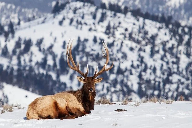
The elk IDs are: 572, 595, 654, 656, 671, 706, 900, 902, 903, 907, 909, 911, 913, 914, 916, 917, 918, and we are going to follow them around Yellowstone! I found a cute picture of an elk in the snow here
Exploratory Analysis of Elk Migration
Some questions we want to answer about the elk:
- Do the 17 elk move together as a pack or separately?
- Do the migration patterns change by year?
- Does time of year change the migration patterns?
- what is the average total length oby month of the year?
- How wide or narrow are the migration routes?
- Are there any areas that all of the elk go to?
- Are the elk likely to have the same paths or go elsewhere?
I want to get a quick look of how the elk move across the map. Let’s plot where the elk are on the map for each year!
elk_df |>
  mutate(year = year(datetime)) |>
  ggplot(aes(x = long, y = lat, color = elk_id)) +
  geom_point(alpha = 0.3) +
  facet_grid(~ year) +
  labs(
    title = "Elk Migration by Year",
    x = "Longitude",
    y = "Latitude",
    color = "Elk ID"
  ) +
  theme_minimal() +
  theme(axis.text.x = element_text(angle = 75))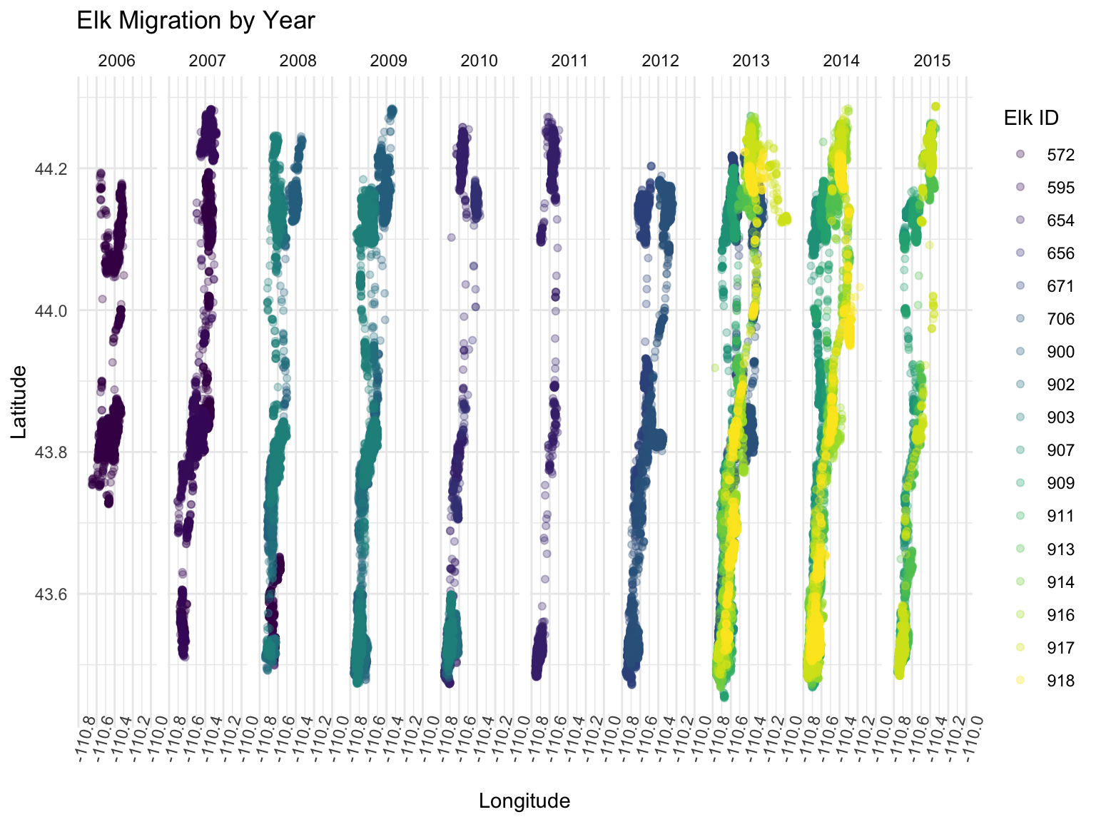
It looks like in 2013 the elk traveled much farther in longitude than the other years. In 2011, the elk did not go nearly as far East as in other years. In 2010 and 2011 there was more sparse travel and it looks like the elk liked to hang out in the far North and far South spots. The data in 2006 looks like it is not as rich and there might be missing data points here.
Let’s find out what the range of latitude and longitude was for the individual elk each year. I want to see the top 10 elk that moved the most. First let’s look at the top 10 movers for latitude.
elk_df |>
  group_by(elk_id, year(datetime)) |>
  summarize(longitude_range = max(long) - min(long)) |>
  arrange(desc(longitude_range)) |>
  head(n= 10) |>
knitr::kable(col.names = c("Elk ID", "Year", "Longitude Range"))| Elk ID | Year | Longitude Range |
|---|---|---|
| 917 | 2013 | 0.7775239 |
| 918 | 2014 | 0.5520892 |
| 706 | 2013 | 0.5067580 |
| 706 | 2012 | 0.4919770 |
| 916 | 2013 | 0.4790952 |
| 918 | 2013 | 0.4757999 |
| 917 | 2014 | 0.4695007 |
| 914 | 2013 | 0.4680962 |
| 913 | 2014 | 0.4584522 |
| 911 | 2014 | 0.4541982 |
We can see that our top 3 movers in terms of longitude are Elk 900, 917, and 916. Elk 917 shows up in this list 3 times for the years 2013, 2014, and 2015. This elk is exploring farther each year!
Now let’s look at the top movers in terms of latitude.
elk_df |>
  group_by(elk_id, year(datetime)) |>
  summarize(latitude_range = max(lat) - min(lat)) |>
  arrange(desc(latitude_range)) |>
  head(n= 10) |>
knitr::kable(col.names = c("Elk ID", "Year", "Latitude Range"))| Elk ID | Year | Latitude Range |
|---|---|---|
| 900 | 2009 | 0.8055470 |
| 917 | 2015 | 0.8034336 |
| 916 | 2014 | 0.8032785 |
| 917 | 2014 | 0.8013303 |
| 654 | 2011 | 0.7895229 |
| 916 | 2013 | 0.7861957 |
| 914 | 2014 | 0.7851894 |
| 654 | 2010 | 0.7849657 |
| 917 | 2013 | 0.7742691 |
| 911 | 2013 | 0.7731564 |
Again we see elk 917 showing up as a top move in terms of latitude for the years 2013, 2014, and 2015 with the range going up each year.This elk is quite the explorer! We can also see that this elk has very similar results to elk 916 for 2013 and 2014. Maybe they move together? We will check this out later in the maps.
Now I want to look at how the total movement of each elk changes across the months of the year.
elk_df |>
  group_by(elk_id, year = year(datetime), month = month(datetime, label = TRUE)) |>
  mutate(
    dist = distHaversine(cbind(long, lat), cbind(lag(long), lag(lat)))  # Calculate distance
  ) |>
  summarize(
    total_distance_km = sum(dist, na.rm = TRUE) / 1000  # Convert to kilometers and sum
  ) |>
  ggplot(aes(x = elk_id, y = total_distance_km, fill = factor(month))) +
  geom_bar(stat = "identity") +  # Using bars to show total distance
  facet_grid(~factor(month)) +
  labs(
    title = "Total Movement by Elk and Month",
    x = "Elk_ID",
    y = "Total Distance (km)",
    fill = "Month") +
  theme(axis.text.x = element_text(angle = 90))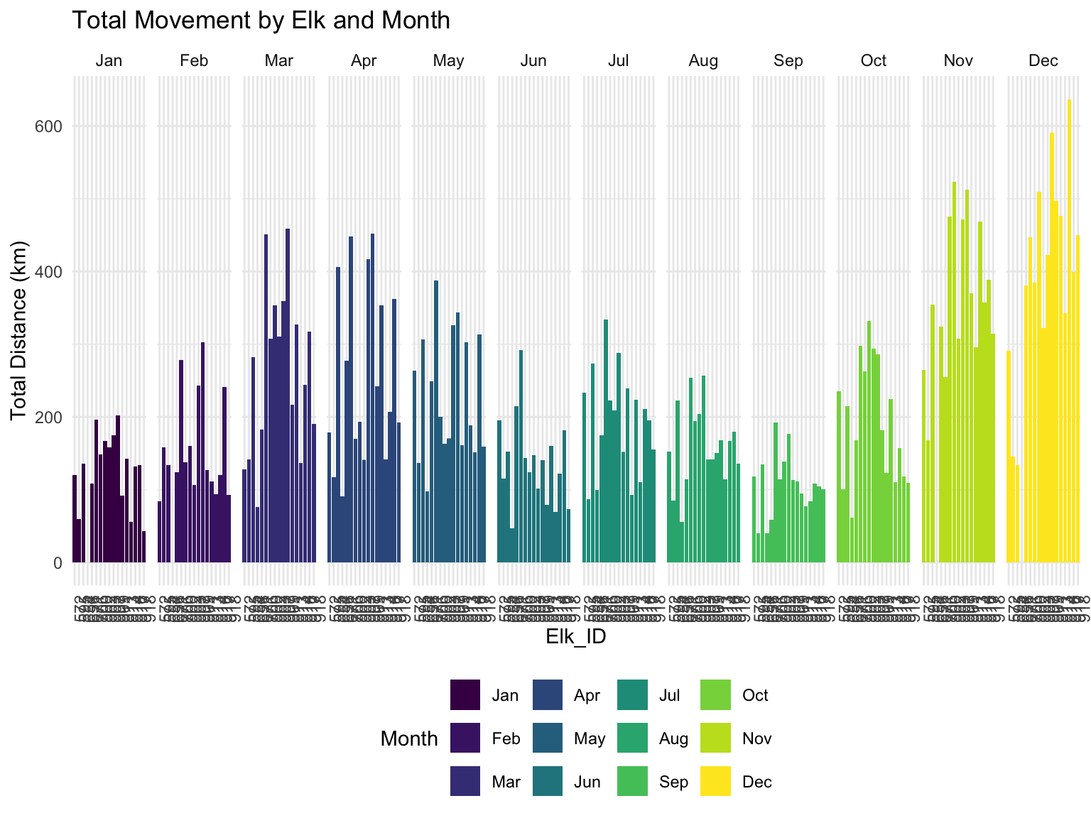
It looks like there is quite a lot of variance in the movement of different elk. What is really interesting is that December is a big moving month! And November is right behind December in terms of total movement. I wonder if this is a pattern that elk have of moving when the temperature drops, or if there is something skewing the data like this.
Let’s look at the daily averages and how this compares for each of the elk. We are going to only look at the IQR so we can see what the movement is like on most days. It looks like most days they move less than 4km.
daily_median =
  elk_df |>
  mutate(
    dist = distHaversine(cbind(long, lat), cbind(lag(long), lag(lat))),
    date = as_date(datetime)
  ) |>
  group_by(elk_id, date) |>
  summarize(daily_sum = sum(dist)) |>
  drop_na() |>
  pull(daily_sum) |>
  median()

elk_df |>
  mutate(
    dist = distHaversine(cbind(long, lat), cbind(lag(long), lag(lat))),
    date = as_date(datetime)
  ) |>
  group_by(elk_id, date) |>
  summarize(daily_sum = sum(dist)) |>
  ggplot(aes(x = elk_id, y = daily_sum)) +
  geom_boxplot(outliers = FALSE) +
  geom_hline(yintercept = daily_median, color = "blue") +
  labs(title = "Daily Averages (m)",
       x = "Elk ID",
       y = "Distance (m)")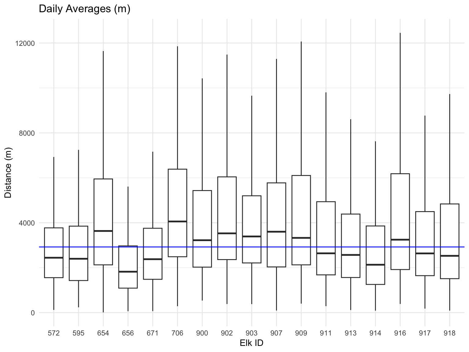
Now let’s look at how far they travel throughout the year.
#calculate the distance they travel each month
elk_seasonal <- elk_df |>
  mutate(
    year = year(datetime),  # Extract year
    month = month(datetime),  # Extract month
    season = case_when(
      month %in% c(12, 1, 2) ~ "Winter",
      month %in% c(3, 4, 5) ~ "Spring",
      month %in% c(6, 7, 8) ~ "Summer",
      month %in% c(9, 10, 11) ~ "Fall"
    )
  ) |>
  arrange(elk_id, datetime)  # Ensure data is ordered

# Calculate distances and group by year, season, and elk_id
elk_distances_seasonal <- elk_seasonal |>
  group_by(elk_id, year, season) |>
  mutate(
    dist = distHaversine(cbind(long, lat), cbind(lag(long), lag(lat)))  # Distance between consecutive points
  ) |>
  summarize(
    total_distance_km = sum(dist, na.rm = TRUE) / 1000  # Convert to kilometers and sum
  ) |>
  ungroup()

# View results
elk_distances_seasonal |>
  pivot_wider(names_from = season, values_from = total_distance_km) |>
knitr::kable(col.names = c("Elk ID", "Year", "Fall", "Spring", "Summer", "Winter"))| Elk ID | Year | Fall | Spring | Summer | Winter |
|---|---|---|---|---|---|
| 572 | 2006 | 405.7831 | 377.9438111 | 333.51581 | 190.8222 |
| 572 | 2007 | 341.4537 | 612.9028261 | 317.12123 | 475.6681 |
| 572 | 2008 | NA | 5.3154399 | NA | 121.2956 |
| 595 | 2007 | 396.3698 | 732.6138642 | 304.24678 | 464.8316 |
| 595 | 2008 | NA | 65.5503306 | NA | 151.1872 |
| 654 | 2010 | 868.6959 | 378.4307358 | 286.02511 | 340.0180 |
| 654 | 2011 | 262.6251 | 925.4660274 | 406.61664 | 360.6568 |
| 656 | 2010 | 107.3442 | 311.9719556 | 315.40274 | NA |
| 671 | 2012 | 465.4135 | 619.6868456 | 277.16046 | 454.0399 |
| 671 | 2013 | 282.7805 | 573.6016099 | 322.51939 | 772.7505 |
| 671 | 2014 | NA | 0.1544104 | NA | 124.0325 |
| 706 | 2012 | 502.3660 | 1394.1510491 | 545.53527 | 558.0115 |
| 706 | 2013 | 700.8248 | 1335.8033390 | 579.88768 | 865.0837 |
| 706 | 2014 | NA | 96.8203797 | NA | 244.2539 |
| 900 | 2008 | 683.3408 | NA | 173.76574 | 400.6717 |
| 900 | 2009 | 652.2398 | 981.2102072 | 443.67582 | 504.5700 |
| 900 | 2010 | NA | 210.9709945 | NA | 161.7985 |
| 902 | 2008 | 782.2258 | NA | 176.26697 | 431.9861 |
| 902 | 2009 | 718.3600 | 842.7059854 | 489.98607 | 685.2068 |
| 902 | 2010 | NA | 244.7504751 | NA | 176.3316 |
| 903 | 2008 | 614.7095 | NA | 258.76966 | 354.5565 |
| 903 | 2009 | 590.8262 | 830.5728629 | 533.42531 | 510.2527 |
| 903 | 2010 | NA | 194.7677693 | NA | 150.6854 |
| 907 | 2013 | 696.8136 | NA | 98.29384 | 403.0529 |
| 907 | 2014 | 606.4804 | 855.9573752 | 326.87529 | 630.9096 |
| 907 | 2015 | NA | 763.7198163 | 27.77920 | 233.8770 |
| 909 | 2013 | 501.4905 | NA | 118.97415 | 699.0534 |
| 909 | 2014 | 341.8683 | 864.2262284 | 294.02829 | 735.1805 |
| 909 | 2015 | NA | 874.2234092 | 147.73195 | 292.2741 |
| 911 | 2013 | 376.5086 | NA | 115.75018 | 713.8169 |
| 911 | 2014 | 227.3693 | 1019.0753388 | 227.67392 | 777.9996 |
| 913 | 2013 | 466.5353 | NA | 108.70759 | 396.5861 |
| 913 | 2014 | 355.2673 | 780.5485311 | 295.70872 | 806.2522 |
| 913 | 2015 | NA | 828.8091654 | 246.01833 | 137.6968 |
| 914 | 2013 | 427.8451 | NA | 102.11854 | 606.4011 |
| 914 | 2014 | 246.2233 | 846.1416349 | 208.71799 | 706.8803 |
| 916 | 2013 | 350.2773 | NA | 149.18155 | 697.2183 |
| 916 | 2014 | 363.5253 | 735.1105827 | 420.55178 | 955.4311 |
| 917 | 2013 | 359.0460 | NA | 94.20210 | 668.1973 |
| 917 | 2014 | 295.1517 | 878.8039901 | 278.73140 | 785.1628 |
| 917 | 2015 | NA | 766.4821076 | 214.19616 | 215.3262 |
| 918 | 2013 | 250.1426 | NA | 138.84747 | 597.2960 |
| 918 | 2014 | 292.0870 | 861.6084099 | 353.42759 | 774.4442 |
Now I am curious what the overlap of the elk are? The data collected is between 2006 and 2015, but we do not have data from all of the elk ids during that time period. It turns out that wild elk can only live up to 10-12 years, according to worlddeer.ord. So let’s find out what the time range is for each of these elk.
One thing I want to check is if the number of data points for each elk is skewing the data. Let’s see how the number of data points spread across the time frame.
elk_df |>
  group_by(elk_id) |>
  mutate(
    dist = distHaversine(cbind(long, lat), cbind(lag(long), lag(lat)))  # Distance between consecutive points
  ) |>
  summarize(
    total_distance_km = sum(dist, na.rm = TRUE) / 1000  # Convert to kilometers and sum
  ) |>
knitr::kable(digits = 0)| elk_id | total_distance_km |
|---|---|
| 572 | 2224 |
| 595 | 1331 |
| 654 | 2702 |
| 656 | 557 |
| 671 | 2225 |
| 706 | 3751 |
| 900 | 2735 |
| 902 | 3048 |
| 903 | 2652 |
| 907 | 3073 |
| 909 | 3482 |
| 911 | 2109 |
| 913 | 2711 |
| 914 | 1742 |
| 916 | 2427 |
| 917 | 2760 |
| 918 | 1868 |
# And maybe let's check how many data points we have

elk_df |>
  ggplot(aes(x = elk_id, fill = factor(year(datetime)))) +
  geom_bar() +
  labs(title = "Total Data Points for Each Elk",
       x = "Elk ID",
       y = "# of data points",
fill = "Year") 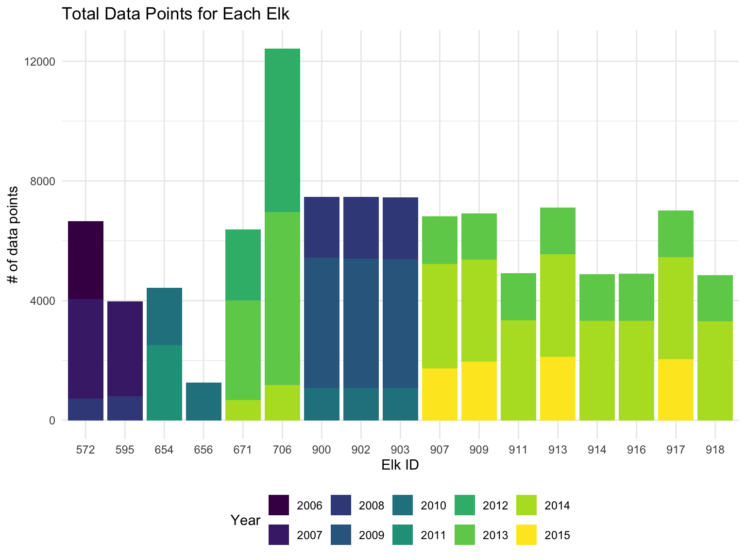
We can see that the data is not consistent for for all of the elk across the 2006-2015 time period. However, there is a lot of overlap for 2 groups of elk. In further analysis we will use the 8 elk that overlap in 2013 and 2014.
elk_df |>
  group_by(elk_id) |>
  summarize(start_time = min(datetime),
            end_time = max(datetime)) |>
knitr::kable()| elk_id | start_time | end_time |
|---|---|---|
| 572 | 2006-03-01 18:00:00 | 2008-03-29 22:00:00 |
| 595 | 2007-01-16 18:00:00 | 2008-03-29 22:00:00 |
| 654 | 2010-03-16 15:00:00 | 2011-12-01 23:00:00 |
| 656 | 2010-03-16 15:00:00 | 2010-10-30 23:00:00 |
| 671 | 2012-03-22 16:00:00 | 2014-03-03 22:00:00 |
| 706 | 2012-01-24 10:00:00 | 2014-03-28 22:00:00 |
| 900 | 2008-07-13 00:00:00 | 2010-03-31 16:00:00 |
| 902 | 2008-07-09 06:00:00 | 2010-05-01 22:00:00 |
| 903 | 2008-07-09 04:00:00 | 2010-05-01 22:00:00 |
| 907 | 2013-07-16 10:00:00 | 2015-07-01 22:00:00 |
| 909 | 2013-07-16 10:00:00 | 2015-07-30 22:00:00 |
| 911 | 2013-07-16 18:00:00 | 2014-12-30 22:00:00 |
| 913 | 2013-07-16 14:00:00 | 2015-08-31 22:00:00 |
| 914 | 2013-07-16 14:00:00 | 2014-12-30 22:00:00 |
| 916 | 2013-07-16 14:00:00 | 2014-12-30 22:00:00 |
| 917 | 2013-07-16 18:00:00 | 2015-08-31 22:00:00 |
| 918 | 2013-07-16 18:00:00 | 2014-12-30 22:00:00 |
elk_df_2013.2014 =
  elk_df |>
  filter(datetime >= as_date("2013-07-16") &
         datetime <= as_date("2014-12-30"),
         elk_id %in% c(907, 909, 911, 913, 914, 916, 917, 918))
The most overlapping data occurs between July 16th 2013 and December 30th, 2014. We have 8 elk that have data for this time range: 907, 909, 911, 913, 914, 916, 917, 918. Now let’s see how they move around!
Plot the seasonal data
elk_monthly = elk_df_2013.2014 |>
  mutate(
    year = year(datetime),
    month = month(datetime, label = TRUE),
  ) |>
  arrange(elk_id, datetime)

# Calculate distances and group by year, season, and elk_id
elk_distance_monthly =
  elk_monthly |>
  group_by(elk_id, year, month) |>
  mutate(
    dist = distHaversine(cbind(long, lat), cbind(lag(long), lag(lat)))  # Distance between consecutive points
  ) |>
  summarize(
    total_distance_km = sum(dist, na.rm = TRUE) / 1000  # Convert to kilometers and sum
  ) |>
  ungroup()


elk_distance_monthly |>
  ggplot(aes(x = as.numeric(month), y = total_distance_km, color = elk_id)) +
  geom_point() +
  geom_smooth(se = FALSE) +
  scale_x_continuous(
    breaks = 1:12,  # Numeric positions for each month
    labels = month.name  # Use month names as labels
  ) +
  labs(title = "Elk Movement by Month 2013-07-16 to 2014-12-30",
       x = "month",
       y = "total distance (km)")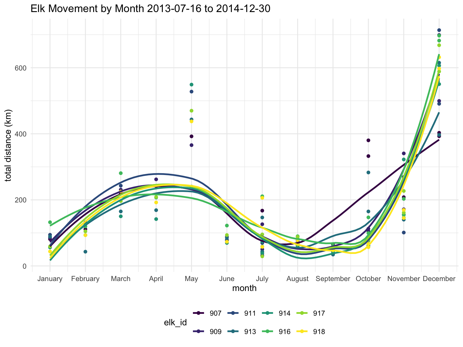
It looks like May and December are when the elk are moving around the most.
I want to check if the number of observations for each month has an impact on these trends. I’m going to see if normalizing the data based on the number of observations has a significant impact on the trends.
elk_distance_normalized =
  elk_monthly |>
  group_by(elk_id, year, month) |>
  mutate(
    dist = distHaversine(cbind(long, lat), cbind(lag(long), lag(lat)))  # Distance between consecutive points
  ) |>
  summarize(
    total_distance_km = sum(dist, na.rm = TRUE) / 1000,  # Convert to kilometers and sum
    count = n()
  ) |>
  mutate(normal_distance = total_distance_km/count)

elk_distance_normalized |>
  ggplot(aes(x = as.numeric(month), y = normal_distance, color = elk_id)) +
  geom_point() +
  geom_smooth(se = FALSE) +
  scale_x_continuous(
    breaks = 1:12,  # Numeric positions for each month
    labels = month.name  # Use month names as labels
  ) +
  labs(title = "Elk Movement by Month 2013-07-16 to 2014-12-30",
       x = "month",
       y = "normalized distance")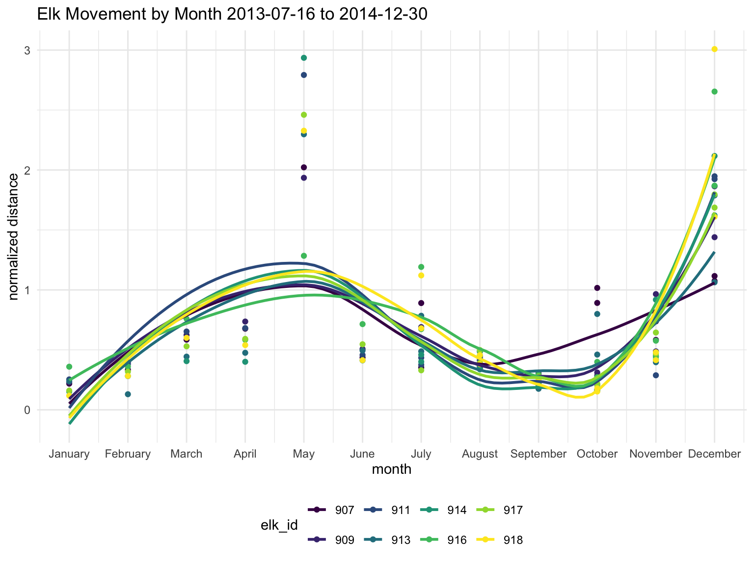
The normalized data has a similar trend so we will continue with the raw data in km.
Let’s see where the elk are moving around in the month of May. Below is the elk mapped in Yellowstone park with their start and end points.
# Let's make a custom elk icon!!
elk_icon <- makeIcon(
  iconUrl = "pics/elk_icon.png", # Replace with the URL of your moose image
  iconWidth = 30, iconHeight = 30
)

filtered_data = elk_df_2013.2014 |>
  filter(month(datetime) == 5)

# Create a color palette (limited to 9 elk IDs for "Set1")
elk_ids = unique(filtered_data$elk_id)  # Get unique elk IDs
num_colors = length(elk_ids)    # Ensure we don't exceed palette limit
path_colors = colorFactor(palette = RColorBrewer::brewer.pal(num_colors, "Set1"), domain = elk_ids)

# Initialize leaflet map
map <- filtered_data |>
  group_by(elk_id) |>
  summarize(start_long = first(long), start_lat = first(lat),
            end_long = last(long), end_lat = last(lat))|>
  ungroup() |>
  leaflet() |>
  addProviderTiles(providers$CartoDB.Positron, group = "Base Map") |>
  addProviderTiles(providers$Esri.NatGeoWorldMap, group = "NatGeo Map") |>
  addMarkers(lng = ~start_long, lat = ~start_lat, icon = elk_icon, popup = ~paste("Start Point: Elk", elk_id)) |>
  addMarkers(lng = ~end_long, lat = ~end_lat, icon = elk_icon, popup = ~paste("End Point: Elk ", elk_id))

# Add lines for each elk's path
for (elk in elk_ids) {
  elk_data <- filtered_data |> filter(elk_id == elk)  # Subset data for each elk
  map <- map |>
    addPolylines(
      data = elk_data,
      lng = ~long, lat = ~lat,
      color = path_colors(elk),  # Assign unique color for each elk
      weight = 2,
      opacity = 0.8,
      label = ~paste("Elk ID:", elk)  # Label showing elk ID
    )
}

# Add a legend for the elk IDs
map <- map |>
  addLegend(
    position = "topright",
    pal = path_colors,
    values = elk_ids,
    title = "Elk ID"
  )

# Print the map
map
From the leaflet we can tell that the elk all started somewhat close together and migrated northward. They all followed a similar path up to Jackson Lake and then some started to choose different paths. Elk 916 decided they liked it and stayed close to the lake for the rest of the month. Elk 911, 914, and 917 seemed to stay together from start until end. Maybe they are in the same heard. Cute!
Now let’s look at the paths for December because that was also a big movement month.
filtered_data = elk_df_2013.2014 |>
  filter(month(datetime) == 12,
         year(datetime) == 2014)

# Initialize leaflet map
map <- filtered_data |>
  group_by(elk_id) |>
  summarize(start_long = first(long), start_lat = first(lat),
            end_long = last(long), end_lat = last(lat))|>
  ungroup() |>
  leaflet() |>
  addProviderTiles(providers$CartoDB.Positron, group = "Base Map") |>
  addProviderTiles(providers$Esri.NatGeoWorldMap, group = "NatGeo Map") |>
  addMarkers(lng = ~start_long, lat = ~start_lat, icon = elk_icon, popup = ~paste("Start Point: Elk", elk_id)) |>
  addMarkers(lng = ~end_long, lat = ~end_lat, icon = elk_icon, popup = ~paste("End Point: Elk ", elk_id))

# Add lines for each elk's path
for (elk in elk_ids) {
  elk_data <- filtered_data |> filter(elk_id == elk)  # Subset data for each elk
  map <- map |>
    addPolylines(
      data = elk_data,
      lng = ~long, lat = ~lat,
      color = path_colors(elk),  # Assign unique color for each elk
      weight = 2,
      opacity = 0.8,
      label = ~paste("Elk ID:", elk)  # Label showing elk ID
    )
}

# Add a legend for the elk IDs
map <- map |>
  addLegend(
    position = "topright",
    pal = path_colors,
    values = elk_ids,
    title = "Elk ID"
  )

# Print the map
map
Now it seems obvious that there is an issue with the December data. There is something going on with the distance between the first data point of the month and the second because it seems unnatural that and elk could move that far in a matter of a few hours. Let’s try to remove the first data point and take another look.
filtered_data = elk_df_2013.2014 |>
  filter(month(datetime) == 12,
         year(datetime) == 2014,
         day(datetime) >= 2)|>
  group_by(elk_id)

# Initialize leaflet map
map <- filtered_data |>
  summarize(start_long = first(long), start_lat = first(lat),
            end_long = last(long), end_lat = last(lat))|>
  ungroup() |>
  leaflet() |>
  addProviderTiles(providers$CartoDB.Positron, group = "Base Map") |>
  addProviderTiles(providers$Esri.NatGeoWorldMap, group = "NatGeo Map") |>
  addMarkers(lng = ~start_long, lat = ~start_lat, icon = elk_icon, popup = ~paste("Start Point: Elk", elk_id)) |>
  addMarkers(lng = ~end_long, lat = ~end_lat, icon = elk_icon, popup = ~paste("End Point: Elk ", elk_id))

# Add lines for each elk's path
for (elk in elk_ids) {
  elk_data <- filtered_data |> filter(elk_id == elk)  # Subset data for each elk
  map <- map |>
    addPolylines(
      data = elk_data,
      lng = ~long, lat = ~lat,
      color = path_colors(elk),  # Assign unique color for each elk
      weight = 2,
      opacity = 0.8,
      label = ~paste("Elk ID:", elk)  # Label showing elk ID
    )
}

# Add a legend for the elk IDs
map <- map |>
  addLegend(
    position = "topright",
    pal = path_colors,
    values = elk_ids,
    title = "Elk ID"
  )

# Print the map
map
After removing the first day of December we can see that the elk really did not move that much. They stayed around the elk flats near Jackson Hole.