Weather Analysis
knitr::opts_chunk$set(warning = FALSE) library(tidyverse)
library(ggmap)
library(geosphere)
library(lubridate)
library(plotly)
library(patchwork)elk = read_csv("clean_data/elk.csv")
raw_weather <- read_csv("raw_data/raw_weather_data.csv")
weather_stations <-
raw_weather |>
group_by(NAME, LATITUDE, LONGITUDE) |>
summarize(n_obs = n())
potential_stations <-
c("LEWIS LAKE DIVIDE, WY US", "SNAKE RIVER, WY US", "SNAKE RIVER STATION, WY US", "BASE CAMP, WY US",
"MORAN 5 WNW, WY US", "JACKSON 29.9 NNE, WY US", "BURRO HILL WYOMING, WY US", "MOOSE 1 NNE, WY US",
"MOOSE, WY US", "MOOSE .4 S, WY US", "JACKSON 12.3 NE, WY US", "JACKSON 12.2 NE, WY US",
"JACKSON HOLE AIRPORT, WY US", "JACKSON, WY US")
four_stations <-
c("SNAKE RIVER STATION, WY US", "MORAN 5 WNW, WY US", "BURRO HILL WYOMING, WY US", "MOOSE 1 NNE, WY US")
reduced_weather_stations <-
raw_weather |>
filter(NAME %in% four_stations) |>
group_by(NAME, LATITUDE, LONGITUDE) |>
summarize(n_obs = n()) |>
arrange(desc(n_obs))
reduced_weather <-
raw_weather |>
filter(NAME %in% four_stations)
all_data <- read_csv("clean_data/all_data.csv")
daily_elk <-
all_data |>
mutate(year_month_day = format(dt, "%Y-%m-%d"),
elk_id = as.character(elk_id)) |>
group_by(
elk_id,
year_month_day,
year,
month,
day,
tavg,
prcp,
snow,
snwd,
tmin,
tmax
) |>
summarize(
dist_km = sum(dist_km, na.rm = TRUE),
land_cover = mean(land_cover, na.rm = TRUE)
)Among the key factors that we considered to be potentially influential to elk migration was local weather patterns, specifically precipitation (including rain and snow) and average temperature. For this, we analyzed weather station data provided by NOAA National Centers for Environmental Information, utilizing daily weather records from 2006 to 2015 (to correspond with our elk migration data).
Selecting Appropriate Weather Stations
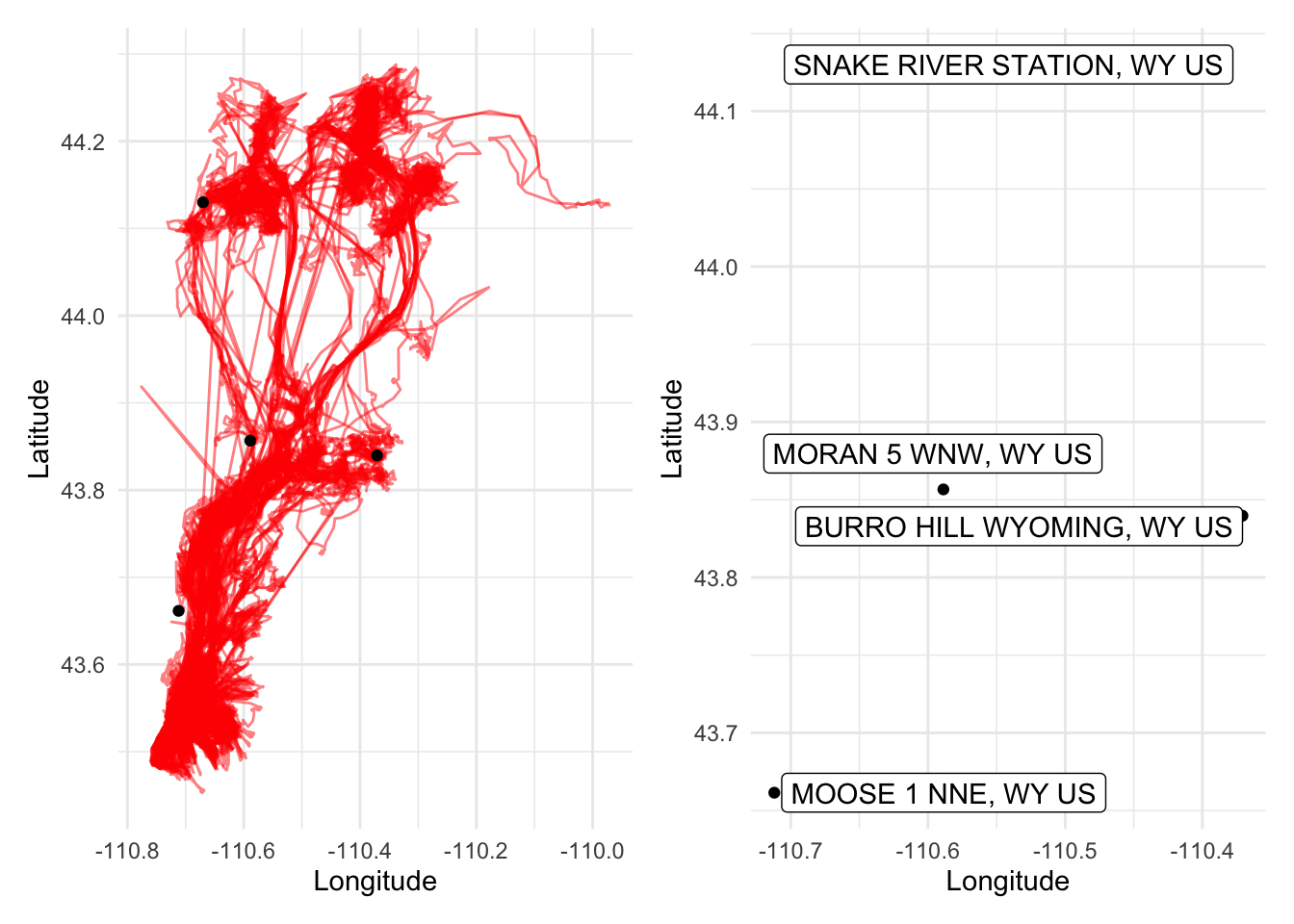
Given that there were numerous weather stations in the Yellowstone/Grand Teton area in Wyoming, several of which were contained within the various elk pathways we analyzed, we decided that the best way to effectively approximate the weather patterns across the entirety migration pathways would be to use the data provided by the four stations in the plots below, which span a wide coverage of the migration areas (shown in red).
four_stations_labels_plot <-
  ggplot(data = reduced_weather_stations,
         aes(x = LONGITUDE, y = LATITUDE)) +
  geom_point() +
  labs(x = "Longitude", y = "Latitude") +
  ggrepel::geom_label_repel(aes(label = NAME),
                            box.padding   = 0.35,
                            point.padding = 0.5,
                            segment.color = 'grey50',
                            max.overlaps = 20)

four_stations_elk_mvmt_plot <-
  ggplot() +
  geom_path(
    data = elk,
    aes(x=long, y=lat),
    alpha = 0.5,
    color = "red") +
  labs(x = "Longitude", y = "Latitude") +
  geom_point(data = reduced_weather_stations, aes(x = LONGITUDE, y = LATITUDE))


four_stations_elk_mvmt_plot + four_stations_labels_plot
Once we selected the appropriate weather stations and reduced our
weather dataset accordingly (reduced_weather), we could
then begin considering various weather-related research questions. These
questions were grouped into two categories: analyzing the weather
patterns visible in the study area over the 2006-2015 period, and
relating the weather data with the elk migration data to see if there
were any visible patterns and/or trends between the two.
Evaluating Weather Patterns and Trends
In the reduced_weather dataset, we were mainly concerned
with four weather variables: PRCP (precipitation),
SNOW (snowfall), SNWD (snow depth), and
TAVG (average temperature). Each of these variables were
visualized using the same graph types. For precipitation, snowfall, and
snow depth, the daily measurements among the four weather stations were
first aggregated by station, year, and month, to show the monthly totals
among each station throughout the 2006-2015 period. These datasets were
further condensed into average monthly totals of precipitation, snowfall
and snow depth among the four stations; this method provided us with an
estimated sum of these three variables covering a wide swath of the
study area. Average temperature was calculated by aggregating daily
average temperature measurements by month and year and taking the mean
of these values.
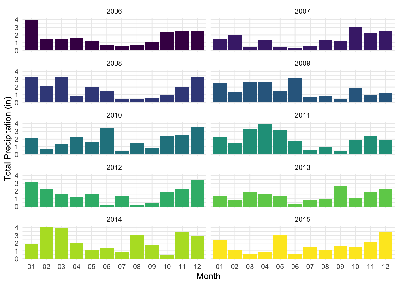
Starting with precipitation patterns, the plots below show relatively consistent patterns in monthly rainfall throughout the given year, in which the summer months often saw less precipitation out of all other seasons, whereas late winter through spring showed generally higher precipitation. While the exact months of these highs and lows vary per year, the general pattern shown each year is a U-shaped distribution from the start of the year to the end.
reduced_weather |>
  select(c(STATION, NAME, LATITUDE, LONGITUDE, DATE, PRCP, SNOW, SNWD, TAVG)) |>
  mutate(year = format(DATE, "%Y"),
         month = format(DATE, "%m")) |>
  group_by(NAME, year, month) |>
  summarize(station_precip_total = sum(PRCP, na.rm = TRUE)) |>
  group_by(year, month) |>
  summarize(station_precip_total_avg = mean(station_precip_total, na.rm = TRUE)) |>
  mutate(year_month = paste(year, month, sep = "-")) |>
  ggplot(aes(x = month, y = station_precip_total_avg, fill = as.factor(year))) +
  geom_bar(stat = "identity") +
  facet_wrap(vars(year), ncol = 2) +
  theme(legend.position = "none") +
  labs(x = "Month", y = "Total Precipitation (in)")
# point + line, separated by month and year
reduced_weather |>
  select(c(STATION, NAME, LATITUDE, LONGITUDE, DATE, PRCP, SNOW, SNWD, TAVG)) |>
  mutate(year = format(DATE, "%Y"),
         month = format(DATE, "%m")) |>
  group_by(NAME, year, month) |>
  summarize(station_precip_total = sum(PRCP, na.rm = TRUE)) |>
  group_by(year, month) |>
  summarize(station_precip_total_avg = mean(station_precip_total, na.rm = TRUE)) |>
  mutate(year_month = paste(year, month, sep = "-")) |>
  plot_ly(
    x = ~month, y = ~station_precip_total_avg, color = ~year, group = ~year, type = 'scatter', mode = 'lines'
    ) |>
  layout(xaxis = list(title = "Month"),
         yaxis = list(title = "Total Precipitation (in)"), legend = list(title = list(text = "Year")))
# year-month totals, separated by year
reduced_weather |>
select(c(STATION, NAME, LATITUDE, LONGITUDE, DATE, PRCP, SNOW, SNWD, TAVG)) |>
mutate(year = format(DATE, "%Y"),
month = format(DATE, "%m")) |>
group_by(NAME, year, month) |>
summarize(station_precip_total = sum(PRCP, na.rm = TRUE)) |>
group_by(year, month) |>
summarize(station_precip_total_avg = mean(station_precip_total, na.rm = TRUE)) |>
mutate(year_month = paste(year, month, sep = "-")) |>
plot_ly(
x = ~year_month, y = ~station_precip_total_avg, color = ~as.factor(year), type = "bar"
) |>
layout(xaxis = list(title = "Date (Year, Month)"),
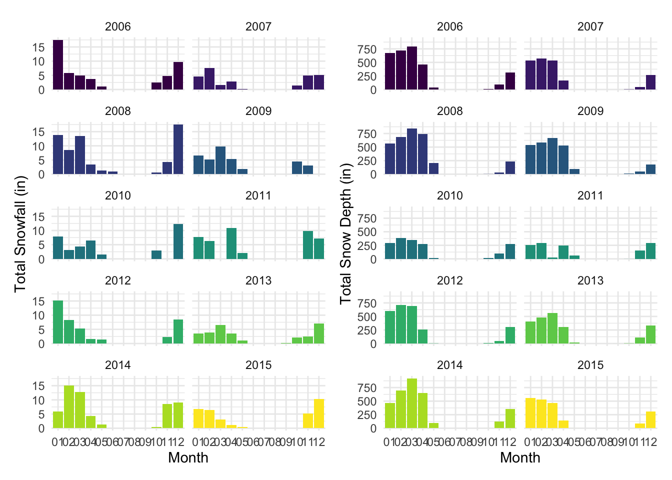
yaxis = list(title = "Total Precipitation (in)"), legend = list(title = list(text = "Year")))Perhaps not surprisingly, snowfall and snow depth were both highest in the winter and early spring months and non-existent in the summer months through early fall. There were slight differences between these two variables such that the highest snow depth measurements were visible for longer (more months out of the year) than when the highest snowfall measurements were visible. These patterns are apparent when comparing the plots side-by-side below. These snow patterns are expected for this area and help validate the reasonability of our weather data.
### snowfall ###
# faceted bar chart, separated by month and year -- KEEP STATIC, USE FOR ANALYSIS PAGE
snowfall_facet_bar <-
  reduced_weather |>
  select(c(STATION, NAME, LATITUDE, LONGITUDE, DATE, PRCP, SNOW, SNWD, TAVG)) |>
  mutate(year = format(DATE, "%Y"),
         month = format(DATE, "%m")) |>
  group_by(NAME, year, month) |>
  summarize(station_snowfall_total = sum(SNOW, na.rm = TRUE)) |>
  group_by(year, month) |>
  summarize(station_snowfall_total_avg = mean(station_snowfall_total, na.rm = TRUE)) |>
  mutate(year_month = paste(year, month, sep = "-")) |>
  ggplot(aes(x = month, y = station_snowfall_total_avg, fill = as.factor(year))) +
  geom_bar(stat = "identity") +
  facet_wrap(vars(year), ncol = 2) +
  theme(legend.position = "none") +
  labs(x = "Month", y = "Total Snowfall (in)")

# point + line
snowfall_line_plotly <-
  reduced_weather |>
  select(c(STATION, NAME, LATITUDE, LONGITUDE, DATE, PRCP, SNOW, SNWD, TAVG)) |>
  mutate(year = format(DATE, "%Y"),
         month = format(DATE, "%m")) |>
  group_by(NAME, year, month) |>
  summarize(station_snowfall_total = sum(SNOW, na.rm = TRUE)) |>
  group_by(year, month) |>
  summarize(station_snowfall_total_avg = mean(station_snowfall_total, na.rm = TRUE)) |>
  mutate(year_month = paste(year, month, sep = "-")) |>
  plot_ly(
    x = ~month, y = ~station_snowfall_total_avg, color = ~as.factor(year), group = ~year, type = 'scatter', mode = 'lines'
    ) |>
  layout(xaxis = list(title = "Month"),
         yaxis = list(title = "Total Snowfall (in)"), legend = list(title = list(text = "Year")))

# year-month totals by year
snowfall_bar_plotly <-
  reduced_weather |>
  select(c(STATION, NAME, LATITUDE, LONGITUDE, DATE, PRCP, SNOW, SNWD, TAVG)) |>
  mutate(year = format(DATE, "%Y"),
         month = format(DATE, "%m")) |>
  group_by(NAME, year, month) |>
  summarize(station_snowfall_total = sum(SNOW, na.rm = TRUE)) |>
  group_by(year, month) |>
  summarize(station_snowfall_total_avg = mean(station_snowfall_total, na.rm = TRUE)) |>
  mutate(year_month = paste(year, month, sep = "-")) |>
  plot_ly(
    x = ~year_month, y = ~station_snowfall_total_avg, color = ~year, type = 'bar'
    ) |>
  layout(xaxis = list(title = "Date (Year, Month)"),
         yaxis = list(title = "Total Snowfall (in)"), legend = list(title = list(text = "Year")))

### snow depth ###
# faceted bar chart, separated by month and year -- KEEP STATIC, USE FOR ANALYSIS PAGE
snowdepth_facet_bar <-
  reduced_weather |>
  select(c(STATION, NAME, LATITUDE, LONGITUDE, DATE, PRCP, SNOW, SNWD, TAVG)) |>
  mutate(year = format(DATE, "%Y"),
         month = format(DATE, "%m")) |>
  group_by(NAME, year, month) |>
  summarize(station_snowdepth_total = sum(SNWD, na.rm = TRUE)) |>
  group_by(year, month) |>
  summarize(station_snowdepth_total_avg = mean(station_snowdepth_total, na.rm = TRUE)) |>
  mutate(year_month = paste(year, month, sep = "-")) |>
  ggplot(aes(x = month, y = station_snowdepth_total_avg, fill = as.factor(year))) +
  geom_bar(stat = "identity") +
  facet_wrap(vars(year), ncol = 2) +
  theme(legend.position = "none") +
  labs(x = "Month", y = "Total Snow Depth (in)")

# point + line
snowdepth_line_plotly <-
  reduced_weather |>
  select(c(STATION, NAME, LATITUDE, LONGITUDE, DATE, PRCP, SNOW, SNWD, TAVG)) |>
  mutate(year = format(DATE, "%Y"),
         month = format(DATE, "%m")) |>
  group_by(NAME, year, month) |>
  summarize(station_snowdepth_total = sum(SNWD, na.rm = TRUE)) |>
  group_by(year, month) |>
  summarize(station_snowdepth_total_avg = mean(station_snowdepth_total, na.rm = TRUE)) |>
  mutate(year_month = paste(year, month, sep = "-")) |>
  plot_ly(
    x = ~month, y = ~station_snowdepth_total_avg, color = ~as.factor(year), group = ~year, type = 'scatter', mode = 'lines'
    ) |>
  layout(xaxis = list(title = "Month"),
         yaxis = list(title = "Total Snow Depth (in)"), legend = list(title = list(text = "Year")))

# year-month totals
snowdepth_bar_plotly <-
  reduced_weather |>
  select(c(STATION, NAME, LATITUDE, LONGITUDE, DATE, PRCP, SNOW, SNWD, TAVG)) |>
  mutate(year = format(DATE, "%Y"),
         month = format(DATE, "%m")) |>
  group_by(NAME, year, month) |>
  summarize(station_snowdepth_total = sum(SNWD, na.rm = TRUE)) |>
  group_by(year, month) |>
  summarize(station_snowdepth_total_avg = mean(station_snowdepth_total, na.rm = TRUE)) |>
  mutate(year_month = paste(year, month, sep = "-")) |>
  plot_ly(
    x = ~year_month, y = ~station_snowdepth_total_avg, color = ~year, type = 'bar'
  ) |>
  layout(xaxis = list(title = "Date (Year, Month)"),
         yaxis = list(title = "Total Snow Depth (in)"), legend = list(title = list(text = "Year")))


(snowfall_facet_bar + snowdepth_facet_bar)
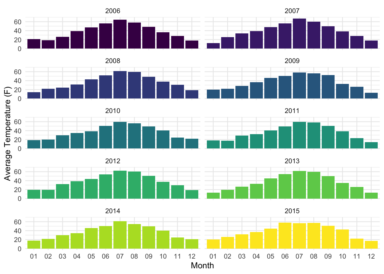
snowfall_line_plotlysnowdepth_line_plotlysnowfall_bar_plotlysnowdepth_bar_plotlyFinally, when visualizing the monthly average temperatures (see below), we see a consistent pattern each year in which the monthly temperatures rise to their peaks in the summer months (July, specifically) and gradually decline after this peak, and the lowest temperatures occurred in January and December. As was the case with our snow data, this is a surprising pattern for Wyoming, and helps validate our data by ensuring that no unexpected shifts in seasonal patterns occurred over the years.
# faceted bar chart, separated by month and year -- KEEP STATIC, USE FOR ANALYSIS PAGE
reduced_weather |>
  select(c(STATION, NAME, LATITUDE, LONGITUDE, DATE, PRCP, SNOW, SNWD, TAVG)) |>
  mutate(year = format(DATE, "%Y"),
         month = format(DATE, "%m")) |>
  group_by(year, month) |>
  summarize(year_month_tavg = mean(TAVG, na.rm = TRUE)) |>
  mutate(year_month = paste(year, month, sep = "-")) |>
  ggplot(aes(x = month, y = year_month_tavg, fill = as.factor(year))) +
  geom_bar(stat = "identity") +
  facet_wrap(vars(year), ncol = 2) +
  theme(legend.position = "none") +
  labs(x = "Month", y = "Average Temperature (F)")
# point + line
reduced_weather |>
  select(c(STATION, NAME, LATITUDE, LONGITUDE, DATE, PRCP, SNOW, SNWD, TAVG)) |>
  mutate(year = format(DATE, "%Y"),
         month = format(DATE, "%m")) |>
  group_by(year, month) |>
  summarize(year_month_tavg = mean(TAVG, na.rm = TRUE)) |>
  mutate(year_month = paste(year, month, sep = "-")) |>
  plot_ly(
    x = ~month, y = ~year_month_tavg, color = ~as.factor(year), group = ~year, type = 'scatter', mode = 'lines'
    ) |>
  layout(xaxis = list(title = "Month"),
         yaxis = list(title = "Average Temperature (F)"), legend = list(title = list(text = "Year")))
# year-month totals
reduced_weather |>
select(c(STATION, NAME, LATITUDE, LONGITUDE, DATE, PRCP, SNOW, SNWD, TAVG)) |>
mutate(year = format(DATE, "%Y"),
month = format(DATE, "%m")) |>
group_by(year, month) |>
summarize(year_month_tavg = mean(TAVG, na.rm = TRUE)) |>
mutate(year_month = paste(year, month, sep = "-")) |>
plot_ly(
x = ~year_month, y = ~year_month_tavg, color = ~year, type = 'bar'
) |>
layout(xaxis = list(title = "Date (Year, Month)"),
yaxis = list(title = "Average Temperature (F)"), legend = list(title = list(text = "Year")))Analyzing Weather Data and Elk Migration Patterns
After examining the weather data by itself, we then visualized these datasets with the elk migration data to see if there were any visible patterns or trends that emerged. More specifically, we wanted to see if changes in each of the four weather measurements affected the total distance traveled by each elk on a given day, and we did so by plotting the total daily distance traveled as the dependent variable against each of the four weather measurements as the dependent variable.
Following the same order as the previous section, we first plotted the daily distance traveled by the elk against the daily precipitation recordings. In the scatterplot below, we see that the daily distance traveled varied more widely when the daily precipitation measurement was lowest, and that this variation decreased as precipitation levels increased. The smooth-mean line (shown in blue below) across all years appears to have a slight positive slope; this is also reflected in the smooth-mean line graph separated by each elk, which shows that several of the elk appear to increase their distance traveled as precipitation increases. Given that many of the other elk do not follow this same trend, and the smooth-mean lines appear to vary from one another, it is not clear to say whether precipitation increases saw an increase in distance traveled by elk.
elk_prcp_distkm_pts <-
  daily_elk |>
  ggplot(aes(x = prcp, y = dist_km)) +
  geom_point() +
  geom_smooth(se = FALSE) +
  labs(x = "Daily Precipitation (in)", y = "Daily Distance Traveled (km)")

style(elk_prcp_distkm_pts, hoverinfo = "none", traces = 2)
elk_prcp_distkm_smooth <-
daily_elk |>
ggplot(aes(x = prcp, y = dist_km, color = as.factor(elk_id))) +
geom_smooth(se = FALSE) +
labs(x = "Daily Precipitation (in)", y = "Daily Distance Traveled (km)", color = "Elk ID")
ggplotly(elk_prcp_distkm_smooth)Similar to the precipitation plot, the snowfall scatterplot also shows greater variation of daily distance traveled among elk at lower snowfall measurements than at higher snowfall measurements. The smooth-mean trend (blue line) does not appear to have much of a positive or negative trend, and while there are only three elk available with associated snowfall data, the smooth-mean trends for each elk follow a similar pattern in which they traveled longer distances on days with lower snowfall, followed by a sharp decline in distance traveled on days with snowfall starting at between approximately 0.3 (Elk 706) and 1.2 in (Elk 654), followed by a gradual increase in distance traveled on days with snowfall starter at or greater than approximately 1.2 (Elk 706) and 3.5 in (Elk 654).
elk_snowfall_distkm_pts <-
  daily_elk |>
  ggplot(aes(x = snow, y = dist_km)) +
  geom_point() +
  geom_smooth(se = FALSE) +
  labs(x = "Daily Snowfall (in)", y = "Daily Distance Traveled (km)")

style(elk_snowfall_distkm_pts, hoverinfo = "none", traces = 2)
elk_snowfall_distkm_smooth <-
daily_elk |>
ggplot(aes(x = snow, y = dist_km, color = elk_id)) +
geom_smooth(se = FALSE) +
labs(x = "Daily Snowfall (in)", y = "Daily Distance Traveled (km)", color = "Elk ID")
ggplotly(elk_snowfall_distkm_smooth)For snow depth, the overall mean-smooth trend does not show a clear positive or negative trend of distance traveled in response to changes in snow depth. However, when examining the mean-smooth trends of each elk , we see similar patterns among all elk, in which there is a rapid increase in distance traveled on days with lower snow depth (between 0 and ~10-15 in for most elk), followed by a rapid decrease in distance traveled among elk on days with snow depth between ~15 and 35-45 in for most elk, then rapid increases in distance traveled for snow depths beyond this point.
elk_snowdepth_distkm_pts <-
  daily_elk |>
  ggplot(aes(x = snwd, y = dist_km)) +
  geom_point() +
  geom_smooth(se = FALSE) +
  labs(x = "Daily Snow Depth (in)", y = "Daily Distance Traveled (km)")

style(elk_snowdepth_distkm_pts, hoverinfo = "none", traces = 2)
elk_snowdepth_distkm_smooth <-
daily_elk |>
ggplot(aes(x = snwd, y = dist_km, color = elk_id)) +
geom_smooth(se = FALSE) +
labs(x = "Daily Snow Depth (in)", y = "Daily Distance Traveled (km)", color = "Elk ID")
ggplotly(elk_snowdepth_distkm_smooth)Lastly, after examining the relationship between daily distance traveled and average daily temperature, we can see a slight downward trend in daily distance traveled among elk as average daily temperature increases, as shown by the main blue mean-smooth line that shows a slightly negative overall slope. This negative relationship is visible in the other plot in which daily distance traveled in response to average temperature is shown for each elk. In this plot, we can see that in general, most elk traveled less on a given day as the average daily temperature increased, and some elk showed a slight uptick in daily distance traveled in the middle of the two temperature extremes (between approximately 25 and 40 degrees F for most elk), before a sharp decline in distance traveled on days with temperatures greater than this range.
elk_avgtemp_distkm_pts <-
  daily_elk |>
  ggplot(aes(x = tavg, y = dist_km)) +
  geom_point() +
  geom_smooth(se = FALSE) +
  labs(x = "Average Daily Temperature (F)", y = "Daily Distance Traveled (km)")

style(elk_avgtemp_distkm_pts, hoverinfo = "none", traces = 2)
## `geom_smooth()` using method = 'gam' and formula = 'y ~ s(x, bs =
## "cs")'elk_avgtemp_distkm_smooth <-
daily_elk |>
ggplot(aes(x = tavg, y = dist_km, color = elk_id)) +
geom_smooth(se = FALSE) +
labs(x = "Average Daily Temperature (F)", y = "Daily Distance Traveled (km)", color = "Elk ID")
ggplotly(elk_avgtemp_distkm_smooth)## `geom_smooth()` using method = 'loess' and formula = 'y ~ x'